Redesigning a legacy reporting tool for 3x more efficiency

Product Design

AI Integration

Redesign

Overview

We were tasked to redesign the legacy custom reporting tool within Lending Insights, an enterprise BI platform used by credit union executives. The existing workflow was inefficient and required frequent reliance on support teams to generate monthly reports.

We redesigned the experience into an AI-enhanced reporting system that empowers executives to independently create, customize, and interpret reports more efficiently and with greater confidence.

Client

Allied Solutions

Team

7 UX Designers

Timeline

Aug - Dec 2025

Context & Legacy Workflow

Credit unions operate under strict regulatory oversight and must prepare detailed, audit-ready reports each month. These reports require highly specific, customized data views across multiple sources.

Lending Insights was built to support this need. However, its custom reporting tool was configuration-heavy and unintuitive.

As a result, executives relied on Allied’s business support teams to generate reports on their behalf. This created frequent back-and-forth communication, increased operational workload for support teams, and inserted an unnecessary middle layer into what should have been a direct, self-serve workflow.

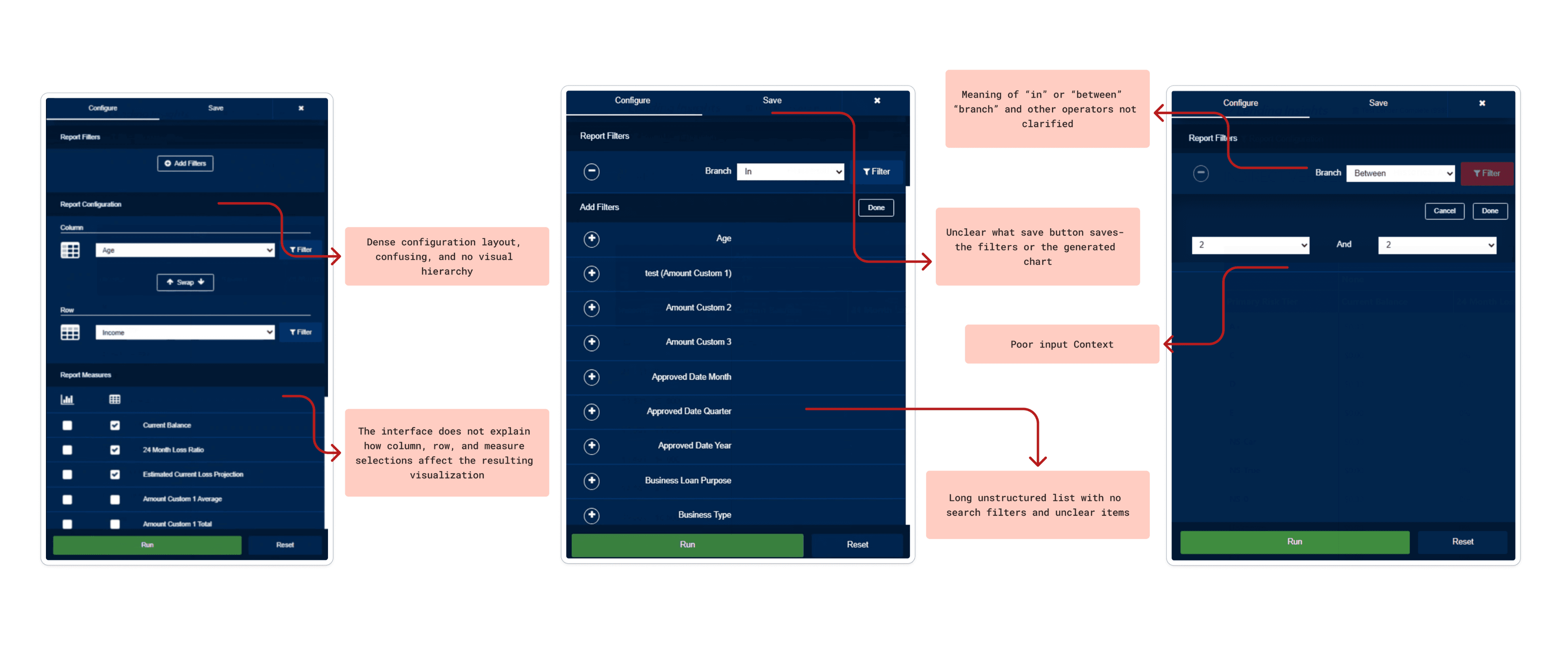
Identifying the Core Problems
Audit

To identify exact friction points in the report generation workflow within Lending Insights, we conducted a detailed audit of the custom reporting tool using Nielsen’s Usability Heuristics.

**scroll through annotations below to see the most prominent heuristic violations**


The evaluation surfaced significant issues throughout the entire tool and countless violations of the usability principles:


The evaluation surfaced significant issues throughout the entire tool and countless violations of the usability principles:

Cognitive Overload

Inefficient Report Configuration

Unclear Information Hierarchy

Low Confidence in Outputs

Cognitive Overload

Unclear Information Hierarchy

Inefficient Report Configuration

Low Confidence in Outputs

Cognitive Overload

Unclear Information Hierarchy

Inefficient Report Configuration

Low Confidence in Outputs

Understanding the User & the Market
Primary Research

We conducted interviews and usability testings with 2 Allied Solutions subject matter experts, 1 finance professor, and 2 business students familiar with reporting and analytics tools to uncover more pain points and understand user needs. We simulated realistic reporting scenarios through role-play based protocols to approximate credit union workflows and context.

Here are the key insights found:

To validate the usability issues identified in our audit, we conducted primary research to understand how users interact with the reporting workflow and where friction occurs in practice.

We conducted interviews and usability testings with 2 Allied Solutions subject matter experts, 1 finance professor, and 2 business students familiar with reporting and analytics tools. Due to the limited availability of credit union executives, we simulated realistic reporting scenarios to approximate their workflows and decision-making context.

Participants were asked to think aloud while configuring reports and navigating the platform, allowing us to observe breakdowns in filtering, customization, and report interpretation.

Direct Control & Real-Time Feedback

Users demanded a flexible display where they could directly edit tables and charts. They expressed extreme frustration over the legacy system's disconnected workflow, which required manual re-running of reports to see changes

Terminology & Navigation Overhaul

Participants struggled to execute basic filtering due to hidden placement, long messy lists, and ambiguous labels. The architecture needed to be completely reorganized for clarity

Advanced Customization & Templates

Users did not want to start from scratch every time. They requested pre-selected template layouts, as well as the ability to save custom dashboard profiles for future use

The "Wizard" AI Approach

Across the board, users rejected generic chatbots on dense data pages. Instead, they wanted an integrated AI "wizard" that could assist with report generation, execute predictive data forecasting directly on graphs, and summarize context-aware, actionable insights

Direct Control & Real-Time Feedback

Users demanded a flexible display where they could directly edit tables and charts. They expressed extreme frustration over the legacy system's disconnected workflow, which required manual re-running of reports to see changes

Advanced Customization & Templates

Users did not want to start from scratch every time. They requested pre-selected template layouts, as well as the ability to save custom dashboard profiles for future use

Terminology & Navigation Overhaul

Participants struggled to execute basic filtering due to hidden placement, long messy lists, and ambiguous labels. The architecture needed to be completely reorganized for clarity

The "Wizard" AI Approach

Across the board, users rejected generic chatbots on dense data pages. Instead, they wanted an integrated AI "wizard" that could assist with report generation, execute predictive data forecasting directly on graphs, and summarize context-aware, actionable insights

Comparative Analysis

To understand the market, my team and I analyzed similar platforms like Domo, Tableau, and Abrigo. Comparing these tools allowed us to identify current industry trends and successful AI integration methods, which directly guided our design direction and future ideation

To understand the market, my team and I analyzed similar platforms like Domo, Tableau, and Abrigo. Comparing these tools allowed us to identify current industry trends and successful AI integration methods, which directly guided our design direction and future ideation

Translating Insights into Solutions
Brainstorming

Using all the insights and takeaways gathered previously, we began sketching ideas and features for the new reporting experience. Below is one of my main sketches that shaped the prototype I made in the next sprint and some ideas the entire team gathered

AI Assisted Prototyping

To translate our sketches into testable concepts in a fast and effective manner, I suggested we leverage AI design tools. With encouragement from our clients, we utilized Figma Make to rapidly generate two distinct high-fidelity prototype flows for A/B testing. This allowed us to immediately visualize our ideas and gather high quality feedback.
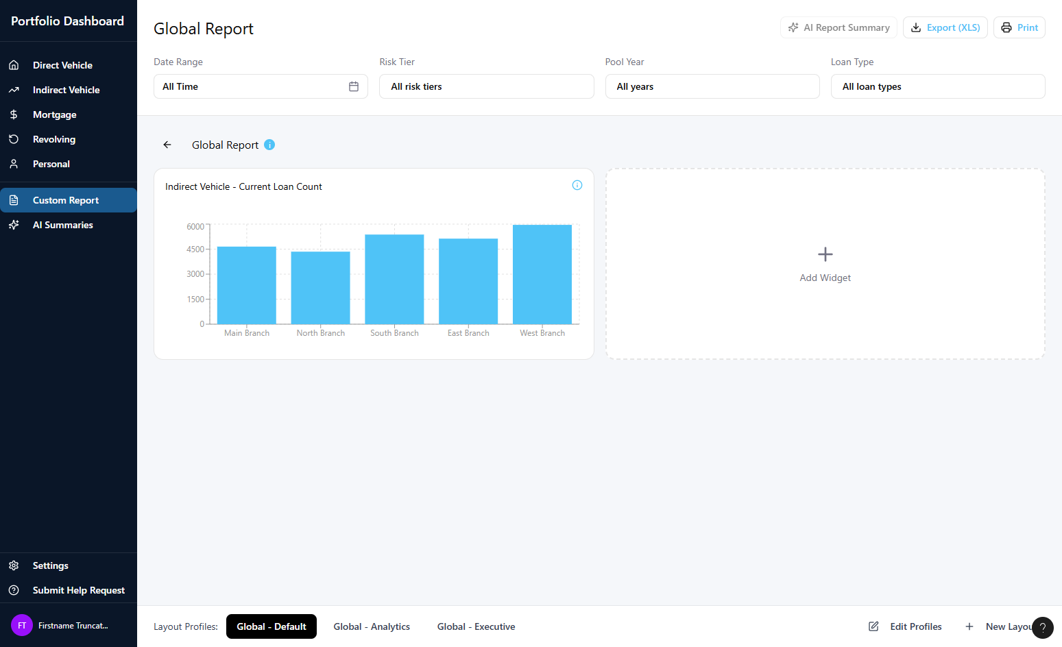
Version A


  • Dashboard-First: Designed for quick, easy starts.

  • Pre-built Templates: Ready-to-use report layouts to jumpstart creation.

  • Opt-In AI: AI features must be manually enabled in settings.

  • Basic Widgets: Simple, guided customization
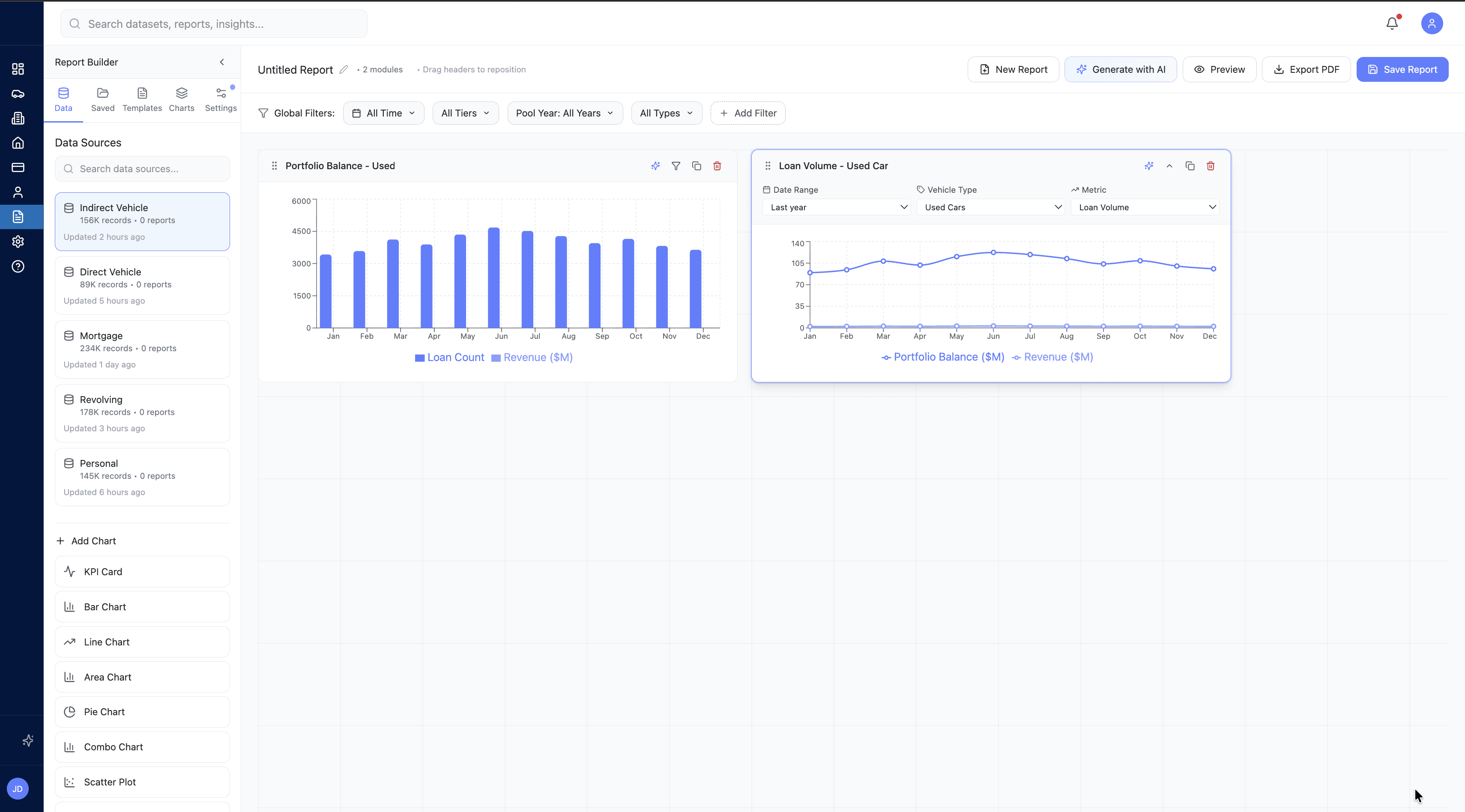
Version B

*My design*

*My design*


  • Tableau-Inspired Builder: A familiar workflow for experienced analysts.

  • Sticky Config Panel: Always-visible tools for precise data editing.

  • Bento-Style Grid: Freely drag, drop, and resize widgets.

  • Embedded AI: One-click forecasting and a full AI report builder panel.

  • Trust & Privacy: Explicit AI permission modal to ensure data transparency.

Validating Concepts and Merging Workflows
A/B Testing

To determine which design direction best solved the core problem, we conducted A/B testing sessions with 3 Subject Matter Experts (SMEs). The testing revealed a clear verdict: users needed a hybrid of both approaches.

Version A

Users strongly preferred the dashboard-first approach of Version A. They noted that having saved reports and pre-built templates immediately visible on the main screen drastically reduced friction compared to hiding them in a side menu

Version B

SMEs emphasized that the comprehensive widget configuration pop-ups and flexible bento-box layout from Version B were absolutely essential for the detailed data manipulation that advanced analysts perform

Iterations

Rather than choosing one prototype over the other, we held a collaborative whiteboarding session to map out a unified design that merged the best of both worlds. Here is an example of how we did executed this:

Rather than choosing one prototype over the other, we held a collaborative whiteboarding session to map out a unified design that merged the best of both worlds. Here is an example of how we did executed this:

After sketching the new combined version, we transformed it into another Figma Make prototype to test further. We conducted a rapid usability test with the same 3 SMEs to ensure our merged concepts hit the mark. This helped us refine details like system status notifications and AI data-source transparency.

Crafting the Final Solution
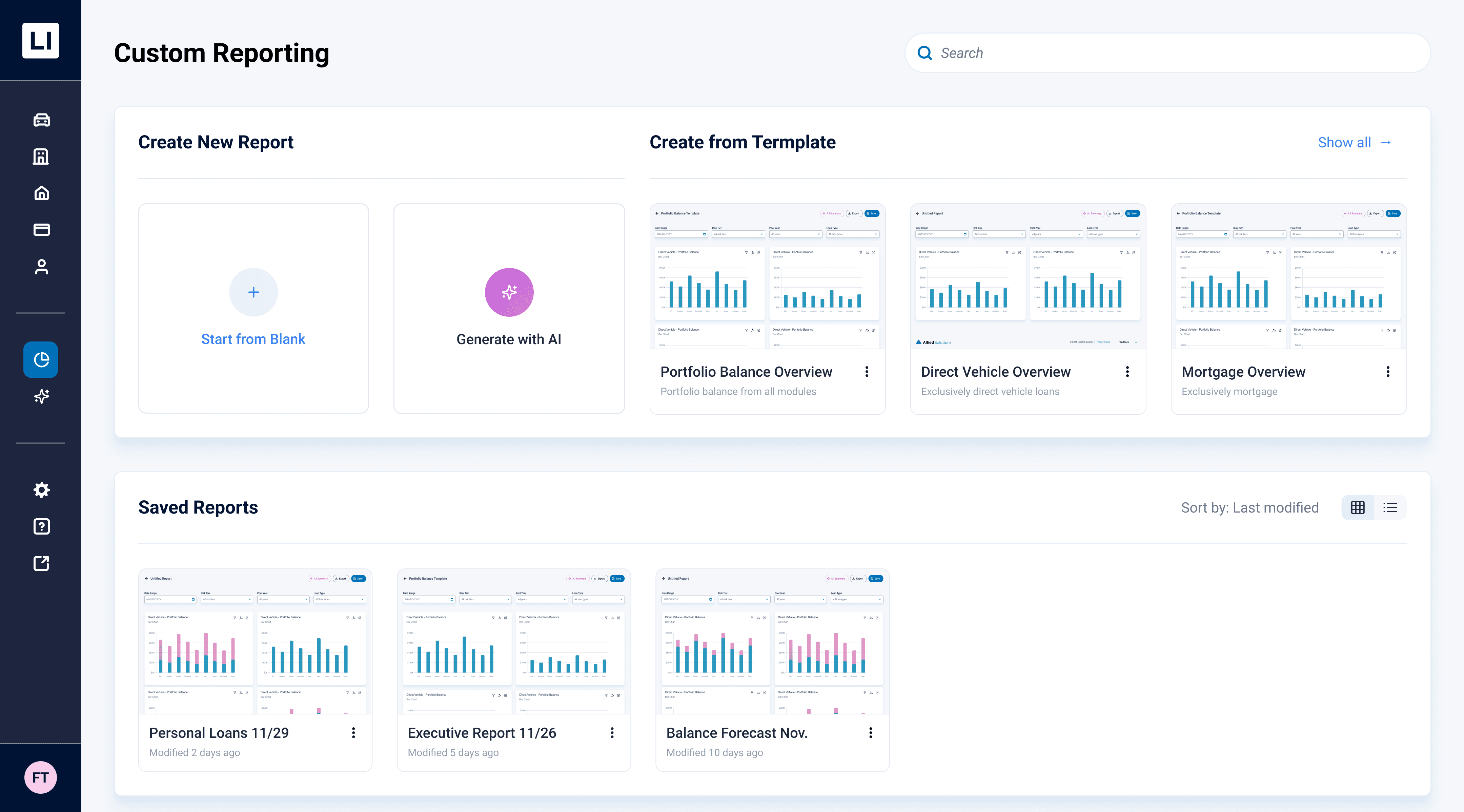
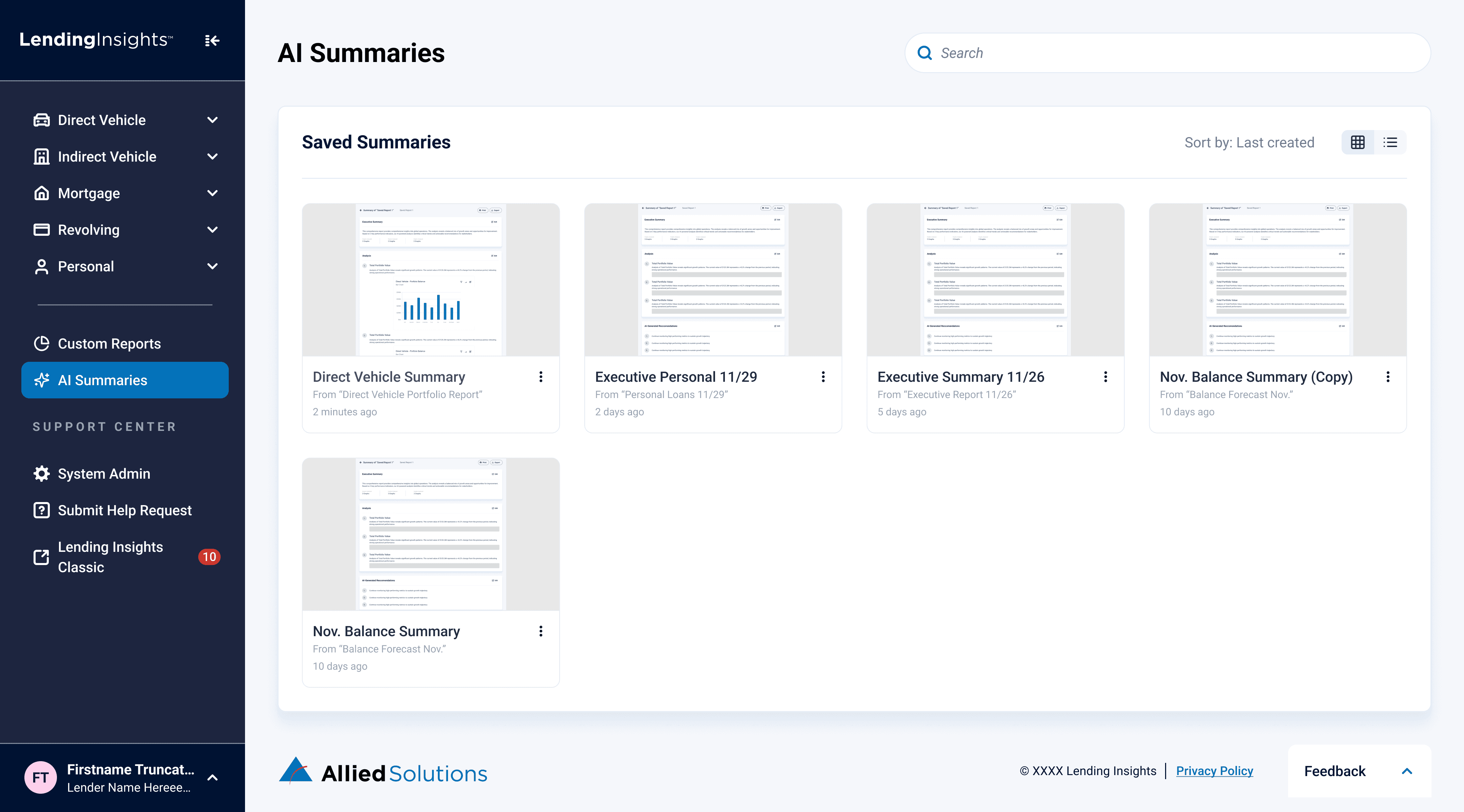
Centralized Custom Dashboard

Users no longer have to dig for reports; the new dashboard provides immediate entry points to build from a blank canvas, utilize pre-built templates, or quickly access visually organized saved reports

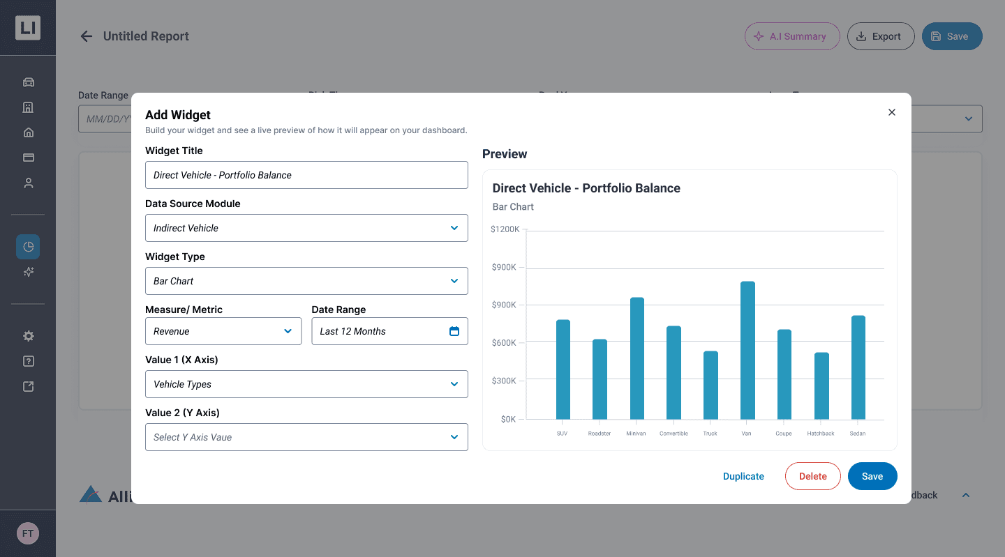
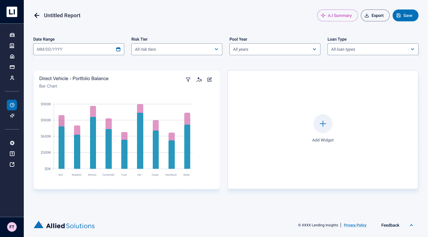
Live-Preview Widget Builder

Replacing clunky configuration lists, the new centralized modal allows users to configure data sources and metrics while instantly visualizing the chart in real-time before adding it to their canvas

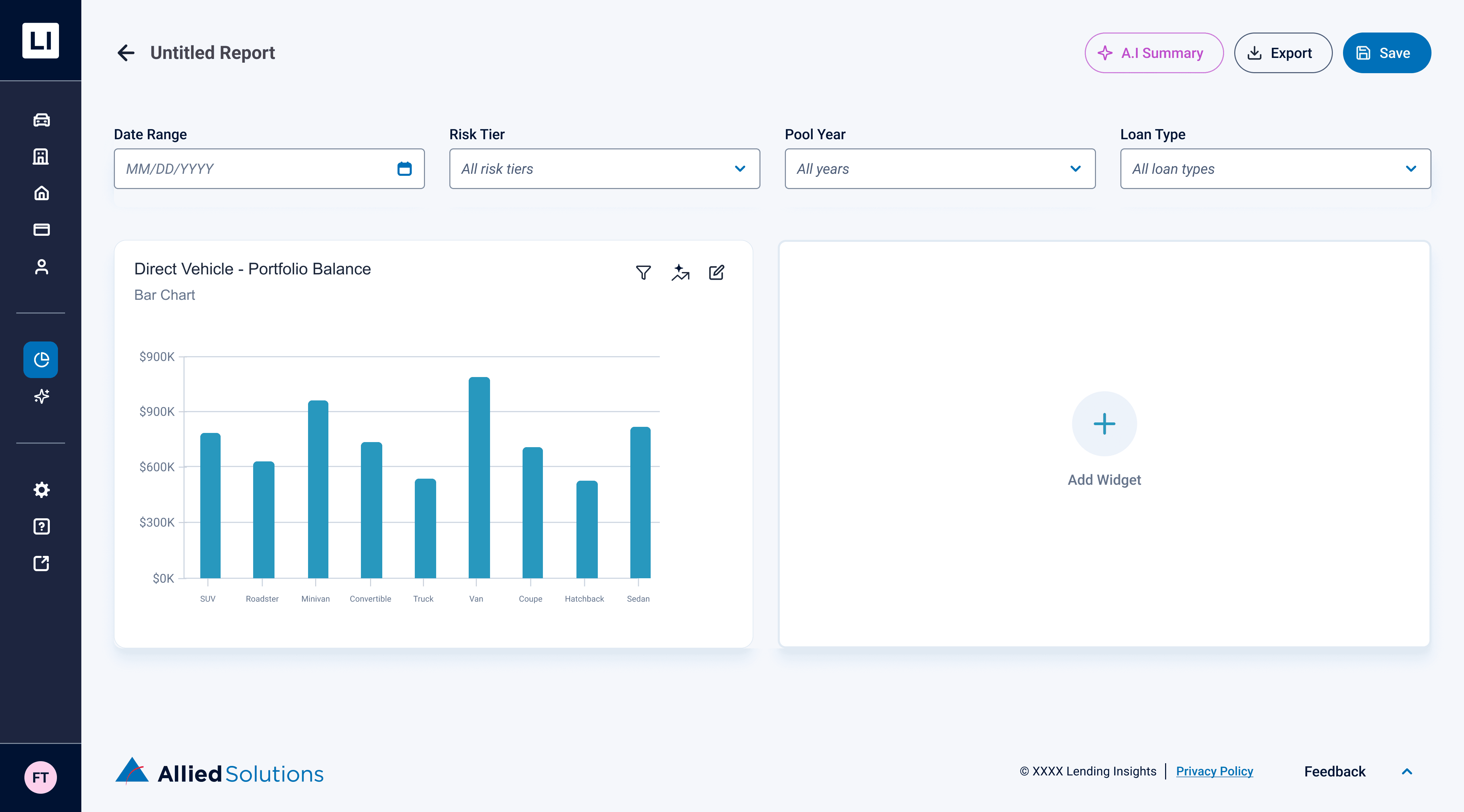
Uniform Global Filtering

Users can apply global filters (like Date Range or Risk Tier) at the top of the report to seamlessly update all widgets at once, maintaining data consistency across the entire dashboard

Data Privacy & AI Permissions

Users can apply global filters (like Date Range or Risk Tier) at the top of the report to seamlessly update all widgets at once, maintaining data consistency across the entire dashboard

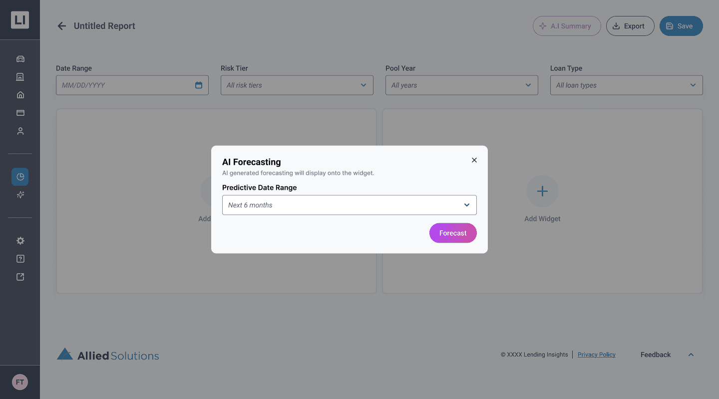
One-Click Predictive Forecasting

By clicking the AI icon on an individual widget, users can instantly project future data trends directly onto their existing graphs

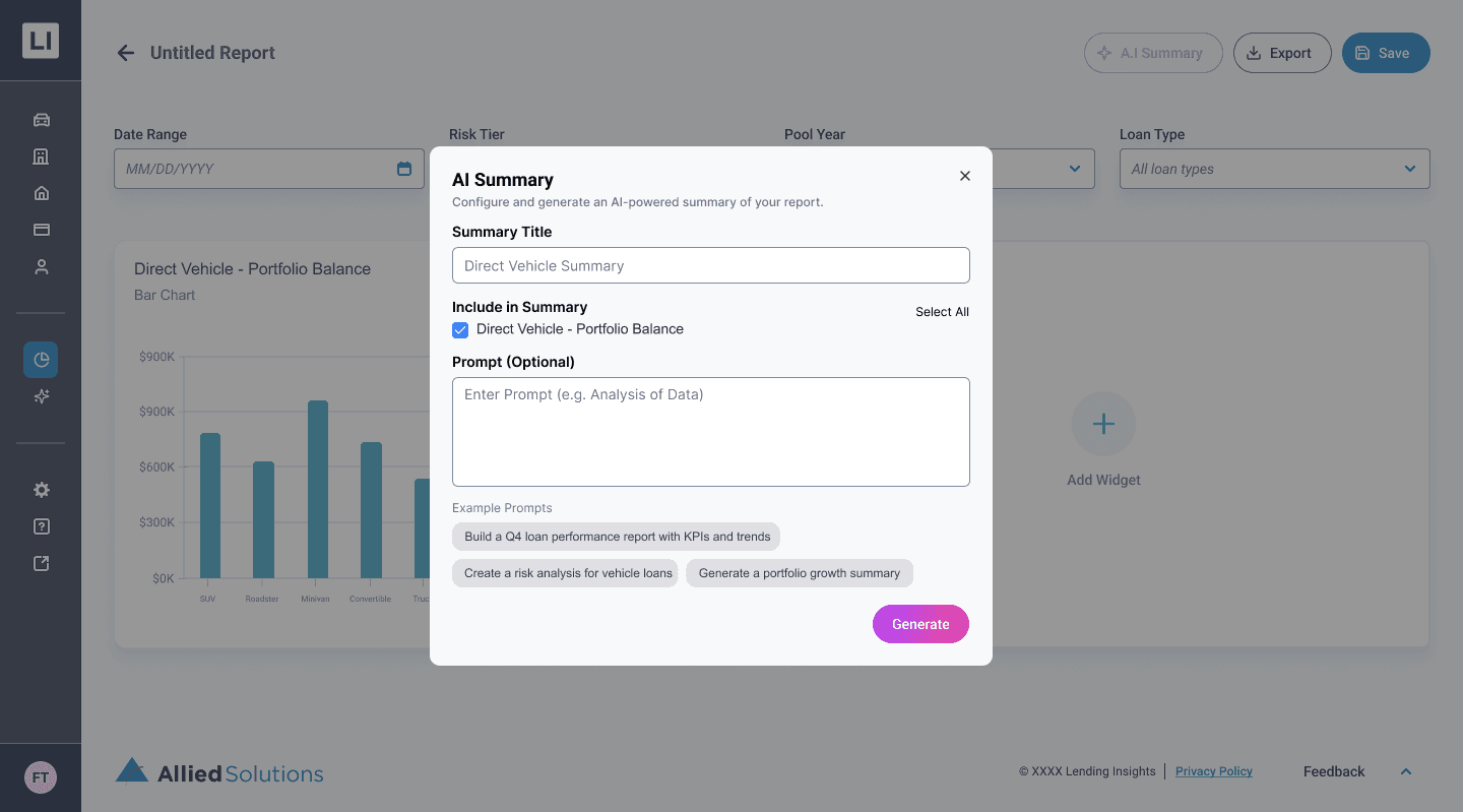
Actionable AI Summaries

Users can select specific widgets and prompt the AI to generate a comprehensive, editable Executive Summary equipped with data analysis and actionable recommendations

The Impact

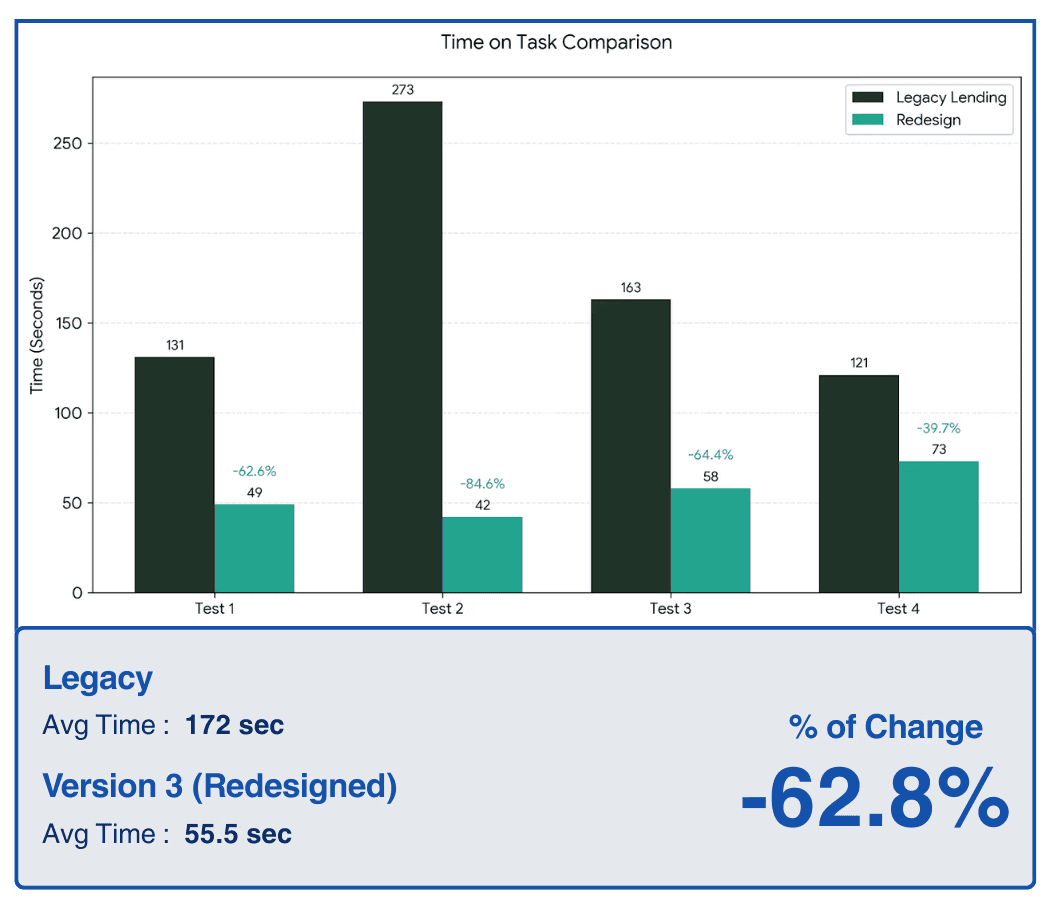
To validate the success of our redesign, we conducted task-based usability testing comparing the legacy platform to our new high-fidelity "Greenfield" prototype. The results proved that streamlining the navigation, clarifying terminology, and introducing the live-preview widget builder drastically reduced user cognitive load.

By transforming an unintuitive interface into a direct, self-serve platform, we achieved significant workflow improvements:

62.8% Faster Task Completion

40.6% Fewer Clicks

62.8% Faster Task Completion

40.6% Fewer Clicks

62.8% Faster Task Completion

40.6% Fewer Clicks

Reflection

Looking back, integrating AI-assisted prototyping was undoubtedly the biggest catalyst for this project's success. I had experimented with Figma Make and other AI design tools in the past just for fun, but I am incredibly glad I could bring that experience into a professional setting and turn it into an actionable, highly impactful part of our workflow.

Through this pivot, I learned significantly more about effective AI prompting and how to utilize AI specifically for user testing. Most importantly, it made our A/B testing far more impactful. By rapidly generating high-fidelity screens, we didn't have to test abstract, low-fidelity wireframes; we were able to present Subject Matter Experts with realistic, interactive interfaces. This allowed us to gather deep, precise feedback much earlier in the process, ultimately leading to a highly validated final product.


Johns Hopkins APL Project

Microsoft Project

In the meantime, here are two other projects you can take a look at:

Note! This portfolio is still under construction.

Please reach out to me if you're looking for something specific

Designing the Future of Autonomous Vehicles on College Campuses | Johns Hopkins APL Project

Streamlining Wire Transfers with AI | Microsoft Project

Note! This portfolio is still under construction. [Been rebranding my designer identity :)) ]

Here are two other projects you can take a look at:

Please reach out to me if you're looking for something specific

Designing the Future of Autonomous Vehicles on College Campuses | Johns Hopkins APL Project

Streamlining Wire Transfers with AI | Microsoft Project

Note! This portfolio is still under construction. [Been rebranding my designer identity :)) ]

In the meantime, here are two other projects you can take a look at:

Please reach out to me if you're looking for something specific

Create a free website with Framer, the website builder loved by startups, designers and agencies.